Drawing Scales and Line Weights Explained
Learn how line weights in drafting create visual hierarchy on blueprints, and how drawing scales let you measure real distances from a small sheet of paper.
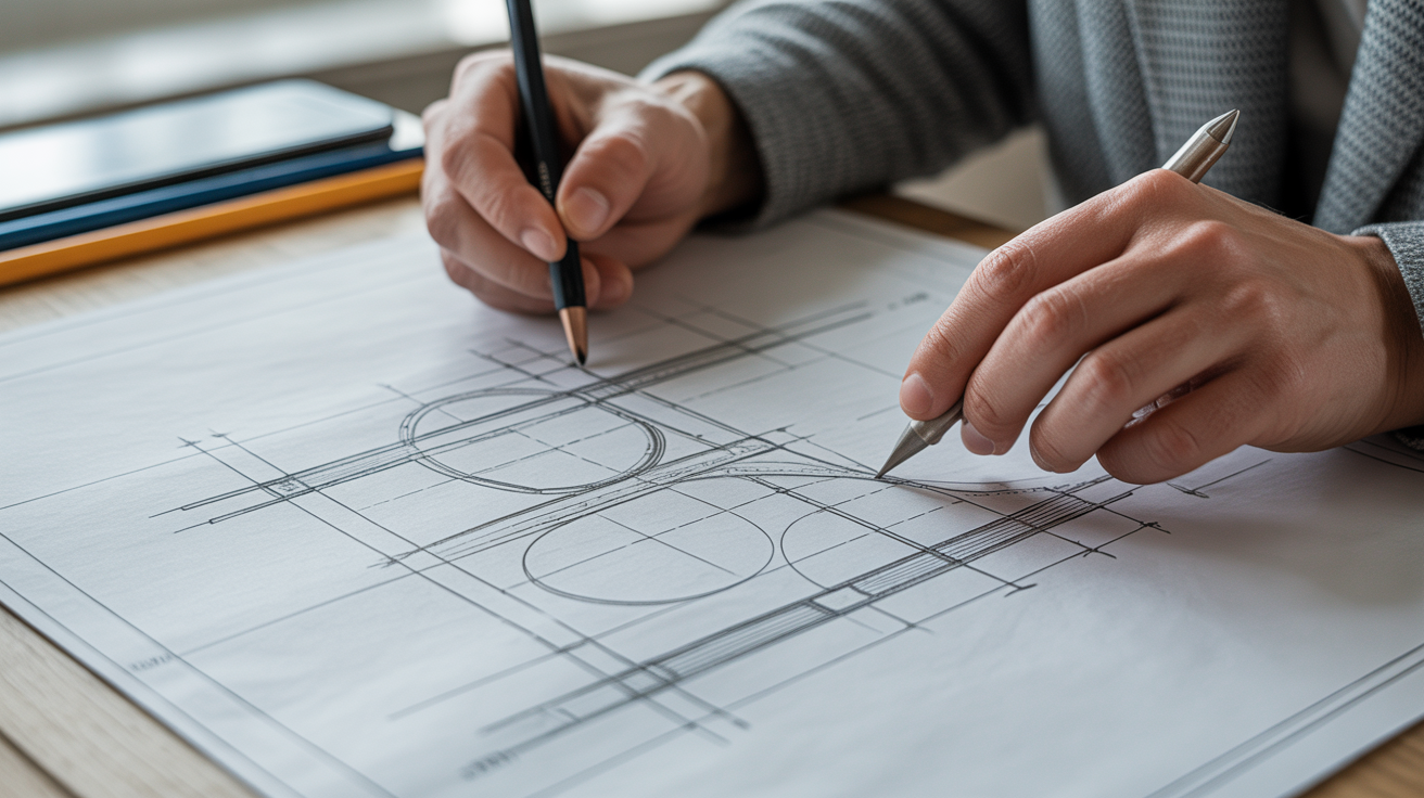
Pick up a set of architectural plans and look closely at the lines. Some are thick and bold, others are thin and crisp, and a few are barely a whisper. That is not an accident or a printing quirk. Every line on a properly drawn blueprint has a deliberate thickness, and the drawing is drawn to a specific scale so that a 30-foot (9-metre) wall fits on an 18-by-24-inch sheet of paper. Once you understand these two ideas, drawings that used to look like a tangled web start to make sense almost immediately.
What Drawing Scale Actually Means
Scale is a ratio. It tells you how much smaller the drawing is compared to the real building.
A scale of 1/4" = 1'-0" (read as "quarter-inch equals one foot") is one of the most common scales for residential floor plans in the United States. That means every quarter inch on the paper represents one real foot. A room that measures 12 feet wide in reality would be 3 inches wide on the drawing (12 × 1/4").
In metric countries, the same idea is expressed differently. A scale of 1:50 means one unit on paper equals 50 of the same units in the real world. A 6-metre wall would be drawn 120 mm long (6000 mm ÷ 50 = 120 mm).
Common Scales and Where You See Them
Different drawing types use different scales because you need to see different levels of detail:
| Drawing Type | Typical US Scale | Typical Metric Scale |
|---|---|---|
| Site plan (whole property) | 1" = 20' or 1" = 40' | 1:200 or 1:500 |
| Floor plan | 1/4" = 1'-0" | 1:50 |
| Enlarged floor plan area | 3/8" = 1'-0" or 1/2" = 1'-0" | 1:20 |
| Wall section | 3/4" = 1'-0" or 1-1/2" = 1'-0" | 1:10 |
| Detail | 1-1/2" = 1'-0" or 3" = 1'-0" | 1:5 or 1:2 |
A site plan at 1" = 40' would show an entire lot on a single sheet, but individual rooms would be tiny specks. A detail at 3" = 1'-0" blows up a small connection so you can see every layer of material. The scale changes so the right amount of information fits clearly on the sheet.
How to Use a Scale Ruler
A standard architect's scale (a triangular ruler with multiple scales engraved on it) has markings for 1/16, 3/32, 1/8, 3/16, 1/4, 3/8, 1/2, 3/4, 1, 1-1/2, and 3 inch scales, all on one tool. To measure a line on a 1/4" = 1'-0" drawing, find the 1/4 face of the ruler, line up the zero end with one end of the line, and read the number where the other end falls. That number is the real-world distance in feet.
Digital drawings let you measure with software tools, but the concept is the same. If the drawing is scaled correctly and you type in the stated scale, the software converts screen pixels to real distances.
One caution worth mentioning: photocopied or PDF drawings sometimes get scaled slightly during printing. Always look for a graphic scale bar (a small ruler printed directly on the sheet). Unlike a stated ratio, a graphic scale bar shrinks or grows with the drawing, so it stays accurate even if the sheet was not printed at its intended size.
Line Weights: The Visual Hierarchy of a Drawing
Line weight refers to the thickness, or width, of a line. In hand drafting it was controlled by choosing a thicker or thinner pencil or pen. In CAD software, line weights are assigned by colour, layer, or a direct property setting, then printed according to a pen-width table.
The basic idea is simple: thicker lines advance visually, thinner lines recede. A drafter uses this to tell you, at a glance, what has been cut through, what is in the background, and what is a note or annotation.
The Three-Tier System Most Drafters Use
Most architectural drawings sort lines into roughly three weight categories:
Heavy lines (the thickest) mark the profile of objects that have been cut through by the drawing's cut plane. On a floor plan, the cut plane passes through the building at about 4 feet (1.2 metres) above the floor. Walls, columns, and structural elements that the cut plane slices through get heavy lines because they are the main subject of the drawing. These are the lines your eye goes to first.
Medium lines show objects that are visible below the cut but have not been sliced through. A kitchen counter, a bathtub, a stair railing seen from above, or the edge of a ceiling soffit visible at floor level all get medium lines. They matter, but they sit behind the cut elements in the visual order.
Light lines (the thinnest) carry dimension strings, leader lines that point to a material note, hatch patterns inside a cut wall to indicate concrete or brick, and annotation text guidelines. These exist to label and explain, not to describe the building itself. They need to be readable but should not compete with the heavier lines.
Why This Matters When You Are Reading Plans
When you pick up an unfamiliar drawing, your eye will naturally follow the thickest lines first. Those lines trace the outline of the building and the positions of the walls. Once you have oriented yourself with the heavy lines, medium lines show you the furniture, fixtures, and built-ins. Then the light lines tell you the dimensions and materials.
If all lines were the same weight, a floor plan would look like a scrambled mess. Line weight hierarchy is what lets a contractor glance at a sheet and immediately find a wall location without hunting through a tangle of equal-looking marks.
For a deeper look at how architectural drawing conventions work together, Architectural Drafting for Beginners covers the tools and vocabulary you will encounter across a full drawing set.
Line Weights in Practice: What to Look For
Cut Lines vs. Below-Cut Elements
Look at any interior wall on a floor plan. The two parallel lines that form the wall thickness should be noticeably heavier than, say, the line showing a windowsill ledge. If the wall lines and the sill lines look the same weight, the drawing has poor hierarchy, which can make it genuinely harder to read. Professional drawings nearly always show this contrast clearly.
Hatch Patterns and Material Indicators
When a wall is cut through, the solid area inside the wall outline is often filled with a hatch pattern. Common patterns include diagonal lines for concrete, a cross-hatch for masonry, and solid fill for structural steel. These hatch lines are drawn with the lightest line weight so they read as texture rather than geometry. If they were drawn heavy, they would look like real lines rather than material indicators.
Hidden Lines
Objects that exist above the cut plane (like an upper cabinet over a kitchen counter) or below a floor (like a foundation beam) are often shown with a dashed line at a medium or light weight. The dashes signal "this is here but you cannot see it from this viewpoint." You will also see dashed lines marking the swing arc of a door or the overhead line of a stair above. These always stay lighter than cut lines so they do not confuse the reading.
Scales and Line Weights Together
The two concepts interact in a practical way. When you change the scale of a drawing, line weights need to adjust too. A line that looks pleasingly bold at 1/4" = 1'-0" might look like a smear at 1/2" = 1'-0" if the weight is not reduced to match the larger scale. CAD software handles this automatically through lineweight tables once they are set up correctly, but hand drafters have to consciously choose a finer pen nib when switching to a larger scale.
The reverse also causes problems. If you print a drawing at a smaller scale than intended (say you shrink a full-size sheet to fit on letter paper), all line weights get thinner proportionally, and the visual hierarchy can collapse. That is another reason to always check the scale bar and confirm the printed scale before reading dimensions off a sheet.
If you are working with software and want to explore how different programs handle scales and lineweights, Best Free Floor Plan Software for Beginners gives an overview of options worth trying.
Deciding Between CAD and Hand Drafting
The fundamentals of scale and line weight apply whether you are using a drafting board or a computer screen. Hand drafting forces you to feel the difference between pencil grades (a 2H pencil makes a fine, light line; an HB or B makes a darker, heavier one). CAD lets you assign weights numerically and change them globally with a few clicks. Both approaches teach the same underlying vocabulary.
If you are trying to decide which path to take, CAD vs Hand Drafting: Which Should You Learn? walks through the trade-offs in plain terms.
Frequently Asked Questions
What does "lineweight hierarchy" mean on a blueprint?
Lineweight hierarchy is the deliberate use of different line thicknesses to communicate the importance or depth of each element in a drawing. Thick lines show objects that have been cut through (like walls on a floor plan), medium lines show visible objects below the cut, and thin lines carry notes and dimensions. The hierarchy lets you scan a drawing quickly by following the thickest lines first.
How do I know what scale a drawing is?
The scale is usually printed in the title block (the information box in the corner of the sheet), often directly below or beside the drawing title. It might read "Scale: 1/4" = 1'-0"" or "1:50". There is often also a graphic scale bar printed on the sheet itself. If the sheet has been printed at an unknown size, use the graphic scale bar rather than the stated ratio to measure accurately.
Can I print a drawing at any size and still use it?
Technically yes, as long as you use the graphic scale bar to calibrate your measurements. The stated scale ratio (like 1/4" = 1'-0") only holds at the intended print size. If you print at a different size, the ratio changes but the graphic scale bar moves proportionally with the drawing, so it stays correct.
Why do some drawings look darker or bolder than others?
This usually comes down to pen settings and printing. A drawing plotted with well-calibrated pen widths will have obvious contrast between heavy, medium, and light lines. A drawing that was plotted with default settings, or scanned and reprinted, can lose that contrast. If everything looks the same weight, try adjusting the contrast or brightness when viewing a digital copy, or ask whoever produced the drawing for a fresh plot.
Do metric and imperial drawings use the same line weight conventions?
Yes. Line weight conventions are universal across both measurement systems. The actual line widths (often expressed in millimetres, even on imperial drawings) follow the same general hierarchy: heavy for cut elements, medium for visible elements, light for annotations. The ISO 128 standard describes line weight conventions used in many countries, though individual offices and firms often have their own standards. Confirm with your local building department or a licensed professional if you have specific requirements for a permit submission.